A Unified System for 300+ Websites
Redesigning the federal judiciary's digital presence through a shared design system that improves public access to information while supporting the needs of individual courts.
Role
Lead UX Designer
Type
Case Study
Client
US Courts
Year
2024
The Challenge
How do you standardize hundreds of websites without making them identical?
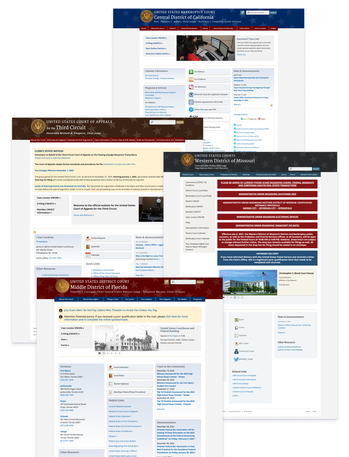
The U.S. Courts needed to modernize more than 300 independently managed court websites and give them a consistently branded identity.
The sites already shared some visual similarities, but court staff controlled how information appeared, which led to inconsistent and inaccessible experiences.
For the public, these differences meant that finding information could require learning a different navigation structure from one court website to the next. A person visiting multiple court sites couldn't necessarily rely on familiar patterns to find what they needed.
Before the Redesign
A design was required that worked across the entire organization while giving each court enough control to manage its own content and identity.
Our goal was to make court information easier to find, establish consistency and accessibility as defaults, and give individual courts flexibility where they actually needed it.
Priorities
The redesign had to accommodate three competing priorities:
 AccessibilityMake accessible design choices the default for non-designer content editors.
 FlexibilityGive individual courts meaningful control over their identity and how they present content.
 ScalabilityEstablish shared components and templates without creating hundreds of custom products.
Designing For Scale
A Shared System With Room for Variation
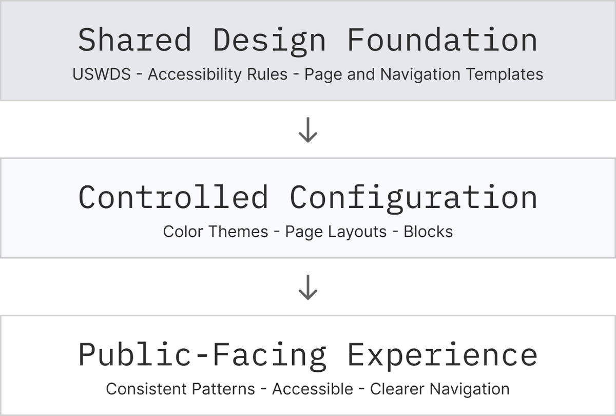
I led the design of a shared system built on the U.S. Web Design System, adapting its components to support the U.S. Courts brand and a configurable multisite experience.
Every court would use the same underlying components, with defined options for color themes, logos, homepage layouts, and content blocks. This gave us a common foundation without requiring hundreds of separate designs.
Design System Layers
Making Themes Interchangeable
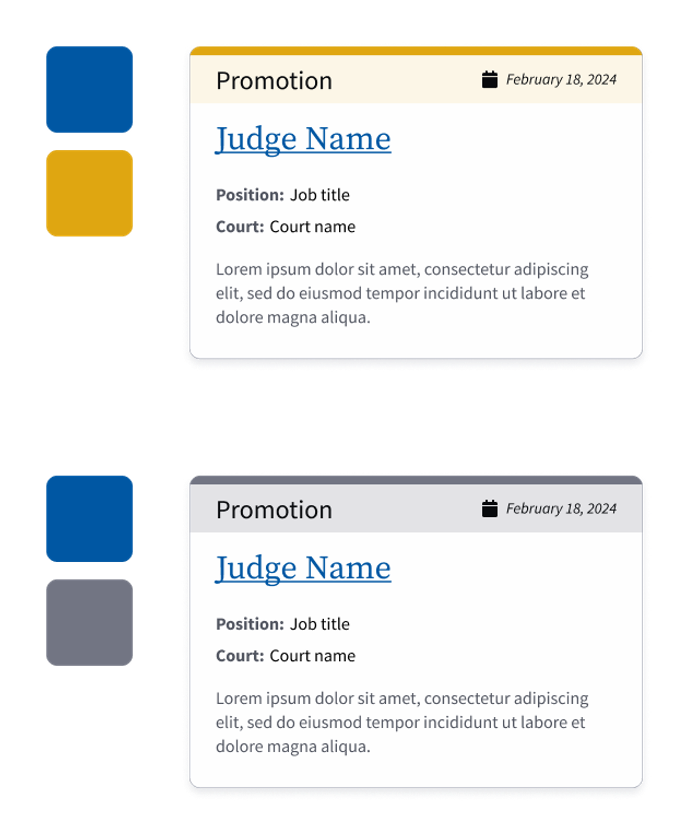
To support visual consistency, I developed a system of design variables that allowed individual courts to apply color themes while maintaining a shared visual foundation.
I coordinated with the developer to align the variable structure with how themes would be implemented, ensuring the design system could support court-specific variations without requiring separate components or extensive customization. I also worked with the brand designer to refine the palettes and preserve accessible color relationships across the themes.
This approach gave courts flexibility while keeping the underlying system consistent and maintainable.
Interchangeable Themes
Research-driven Decisions
Court type wasn't a useful way to organize homepage designs.
The original requirements called for different homepage layouts based on court classification, such as bankruptcy or appellate courts.
Initial Direction: Court Classification
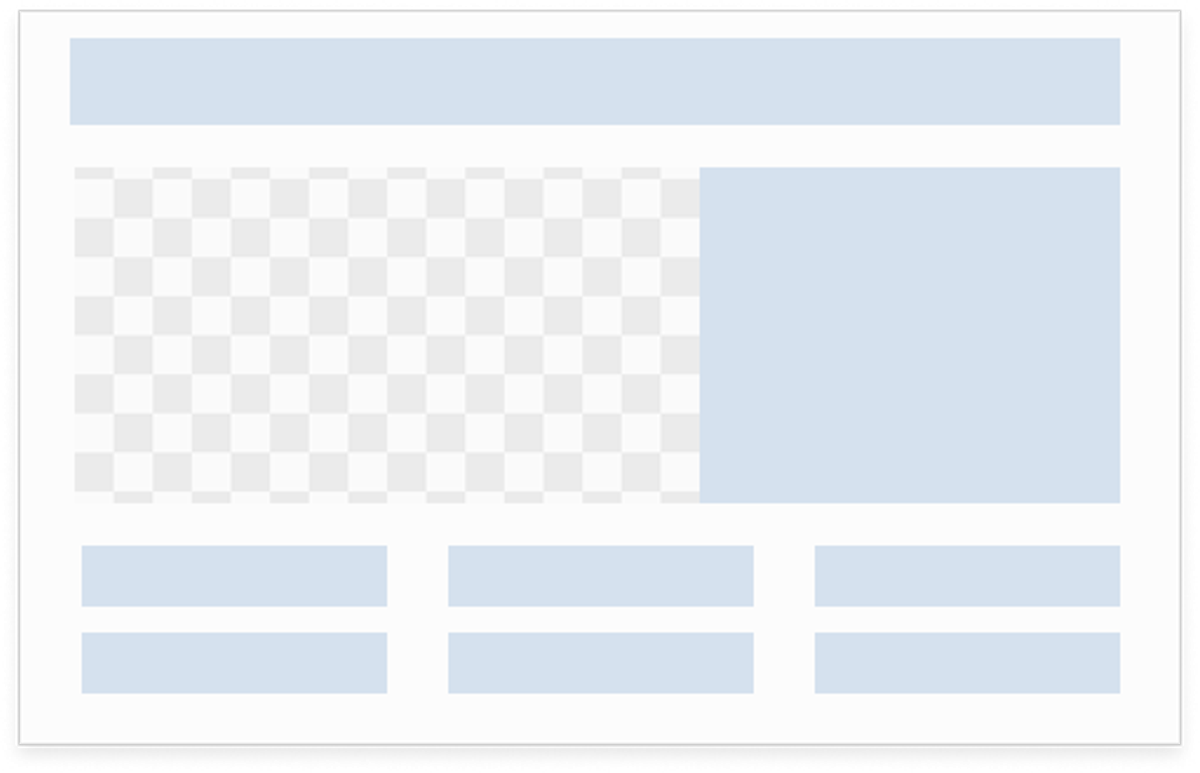 Bankruptcy
 Appellate
 District
My audit of existing court websites challenged that approach. Court type didn't determine what a court needed to publish.
Some courts filled their homepages with news, others prioritized announcements, and others published very little content at all.
A predefined layout on court type would have required some courts to change their publishing practices to fit the design.
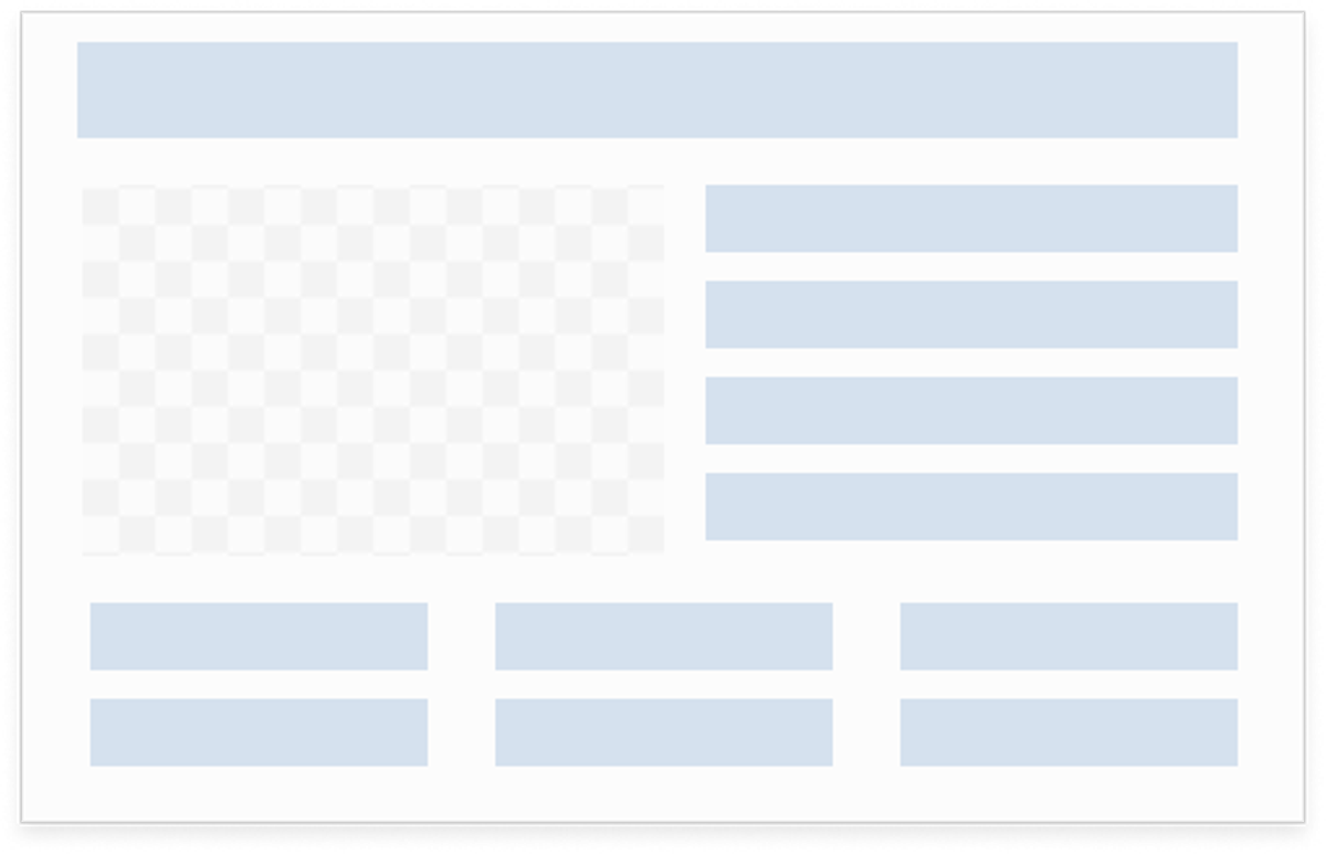
I used these findings to challenge the original requirements and advocate for a more flexible approach based on content needs. This shifted the design direction from predefined layouts for each court type to a set of configurable homepage options.
New Direction: Content Needs
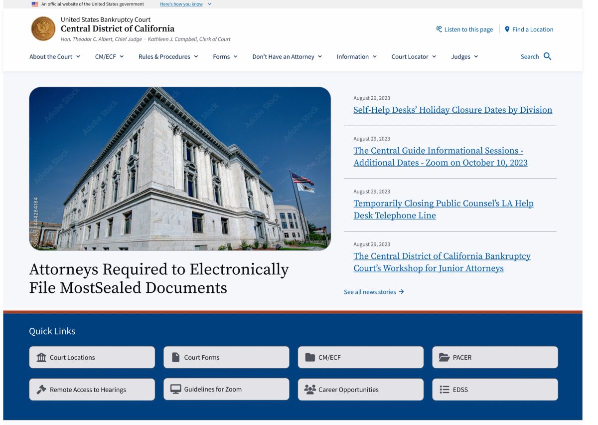 News Focused
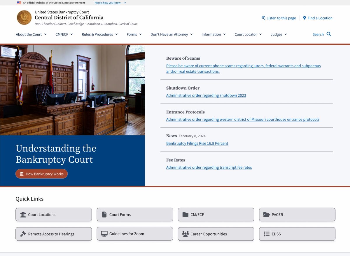 Announcement Heavy
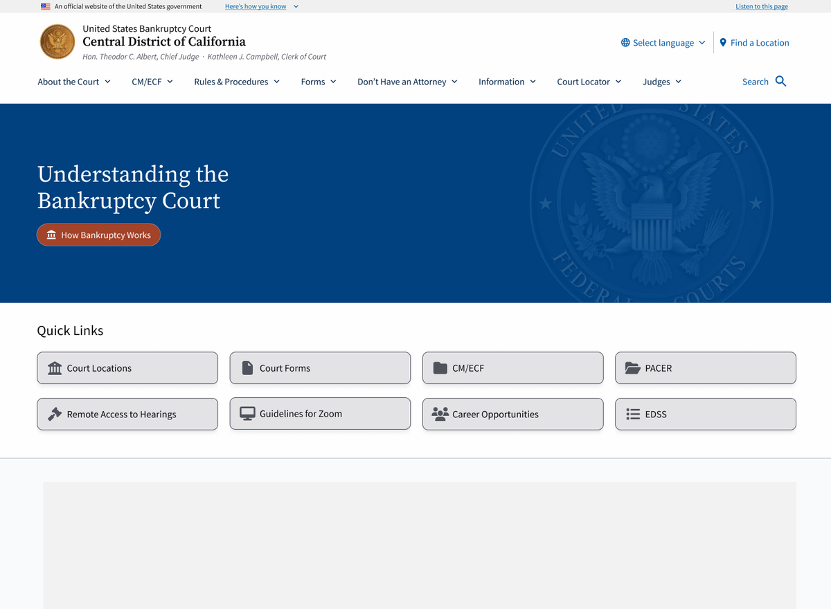 Minimal Content
Accessibility
Building Accessibility Into the Editor
Court staff would be responsible for maintaining their websites, and they weren't necessarily trained in design or accessibility.
Guidelines alone wouldn't be enough. I designed constraints into the content-authoring experience so editors could build pages without having to make every decision themselves.
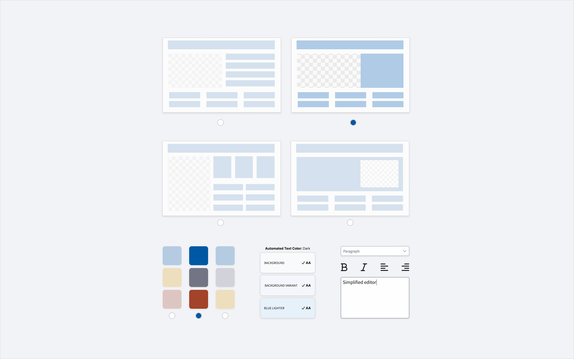
Structured templates provided the starting point, with configurable areas built from approved components.
What the System Controlled
 Heading Hierarchy,Page templates supplied the H1 and the style was removed from the editor.
 Column LayoutsLayout options were limited to prevent text from being compressed into excessively narrow columns.
 Color SelectionEditors could select colors from approved palettes rather than introduce arbitrary colors.
 Available BlocksUnnecessary default editor blocks were removed in favor of a focused set of custom blocks.
Content types such as news stories and judge profiles used predefined templates. Pages that needed more flexibility started with a fixed hero, followed by a block-based content region.
News Template
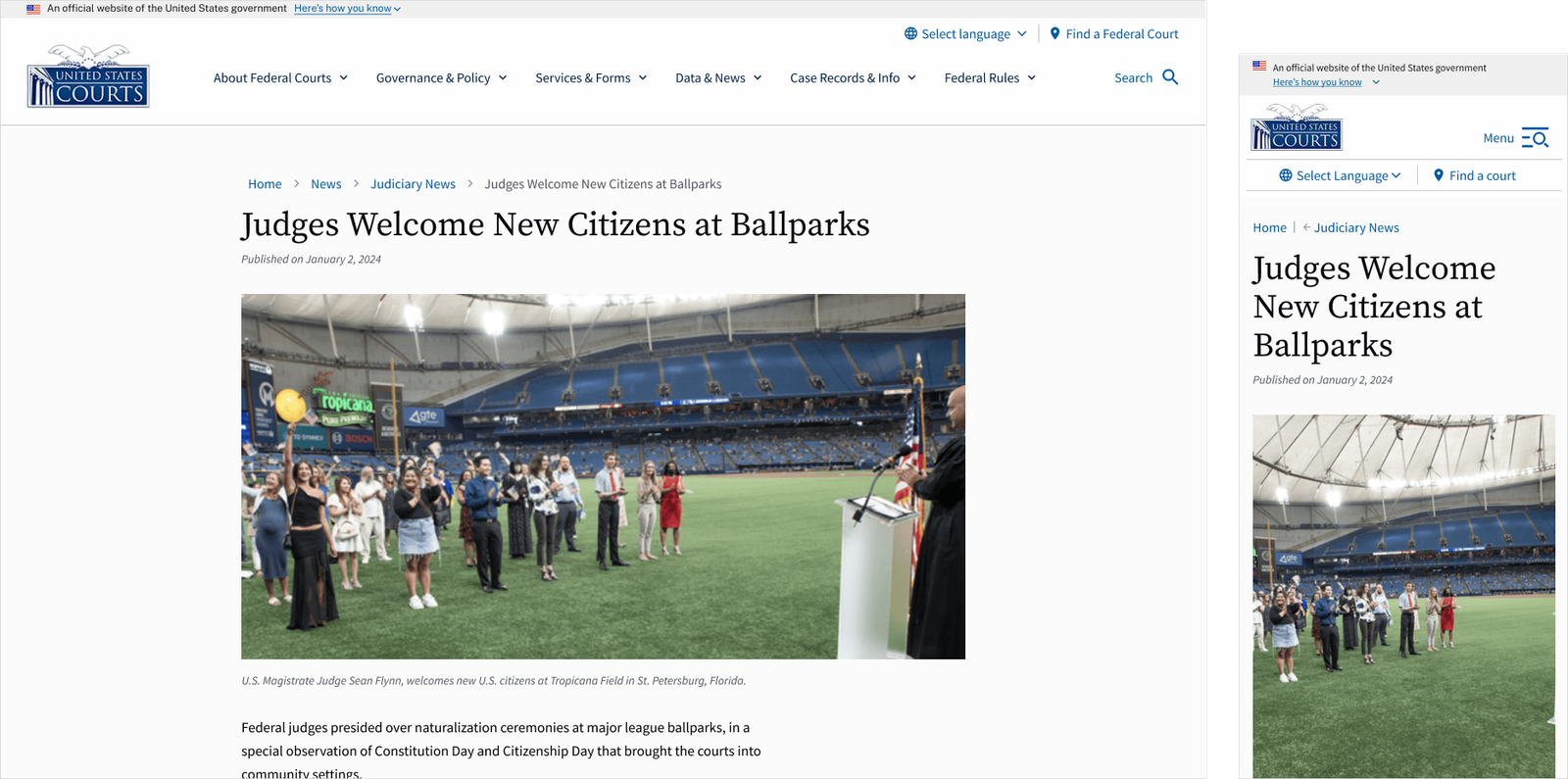
Courts still had control over how they arranged their information, but the templates and components handled presentation decisions that needed to remain consistent.
Information Architecture
Navigation had to work with existing court structures.
People visiting court websites needed to find information within navigation structures that varied considerably from court to court.
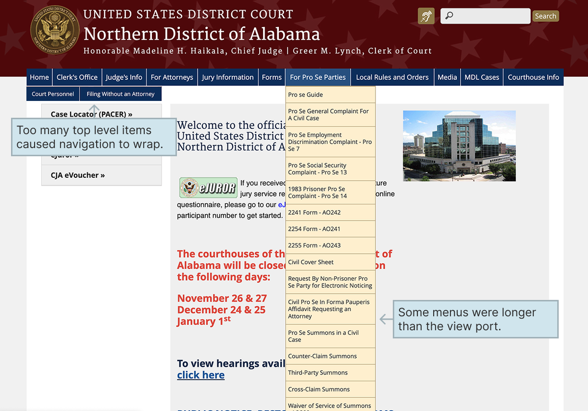
The navigation audit exposed some difficult edge cases. Certain courts had enough top-level items to wrap across multiple lines on desktop, and some dropdown menus extended beyond the viewport.
Navigation Issues
I reviewed existing user research to help validate recommended navigation structures for each court type. I also advocated for plainer language where specialized terminology made information harder to understand.
But courts weren't required to adopt the recommended IA. The shared navigation components needed to accommodate their existing structures, even when those were considerably longer, without making information harder for visitors to find.
I designed dropdown and mega-menu options, with a responsive transition to mobile navigation before the desktop menu started wrapping.
Navigation
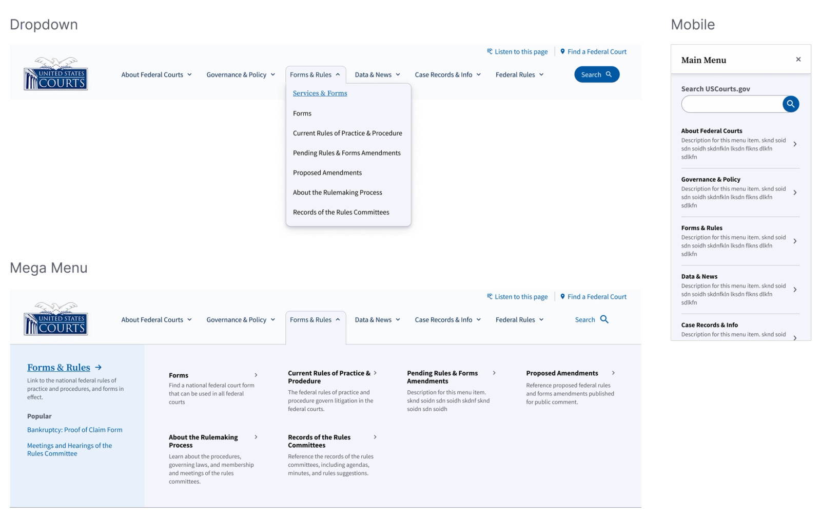
- Dropdown and mega-menu options accommodate different court information architectures, including longer, more complex navigation structures.
- Grouped links, descriptive labels, and supporting context help visitors locate information without relying on specialized court terminology.
- Navigation transitions to a mobile menu before desktop links wrap, preventing crowded or inaccessible navigation at smaller screen widths.
Reworking the Mobile Navigation
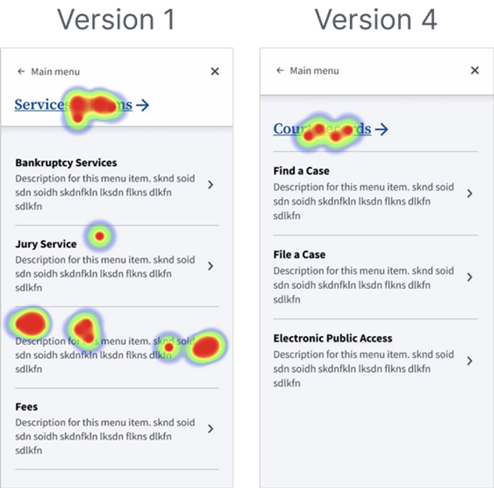
Usability testing revealed another problem. Users struggled to move between navigation levels because of where parent items were placed.
I explored alternative placements and tested the interaction across multiple rounds. The revised design produced better results.
Mobile Navigation Testing
Outcome
A Unified Foundation With Room for Individual Courts
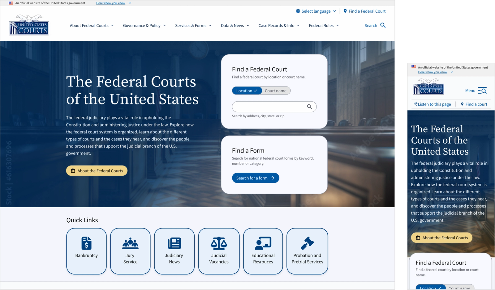
The redesign established a shared design foundation for more than 300 federal court websites while preserving controlled flexibility for individual courts. Accessibility was evaluated throughout the design process, with repeated checks of color contrast and accessibility requirements. Benchmark testing of the existing sites established a baseline that the redesigned system was required to meet or exceed.
Outcomes
- Unified Visual IdentityA shared USWDS-based theme established a consistent foundation across the redesigned experiences.
- Controlled FlexibilityConfigurable themes, logos, and homepage layouts accommodated individual court needs without requiring separate designs.
- Accessibility by DesignRepeated accessibility checks and constrained content-authoring options helped maintain accessible patterns across the system.
 Implementation & Rollout The redesigned system was implemented on uscourts.gov and some individual court websites, with additional court sites planned for rollout as of my last review.
Lower-court stakeholders responded positively to the updated designs during feedback sessions.
My involvement concluded before launch, so I wasn't available to evaluate post-launch accessibility or performance results.
Reflections
The hardest decisions were about where to allow variation.
Designing for hundreds of independently managed websites meant balancing the needs of the central U.S. Courts organization, individual courts, content editors, developers, and the public.
I learned how much of that work comes down to deciding who should control what. Courts needed freedom to publish information in ways that worked for them, while shared components and templates needed to protect accessibility and consistency.