UX process transformation with the National Archives Museum
Project type
Web
My role
Lead UX Designer
Company
Agileana / National Archives
Year
2023-2024
Why this project is important?
This project shows the power of effective collaboration in the design process. By involving stakeholders at every stage, we were able to create a shared vision and ensure that the final product met both user and business needs. As a high-visibility website, the project required careful coordination and clear communication. This led to a process where everyone’s input was valued and considered. This process was then documented and used as a foundation for Agileana's design approach.
Project and contribution summary
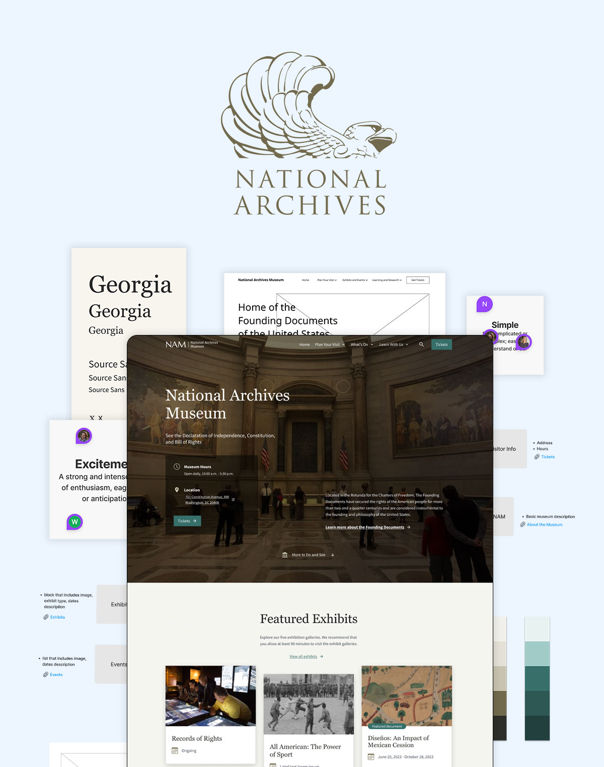
The National Archives Museum website was redesigned to mirror the museum’s generational renovations. capturing its new look and feel in an online experience. The updated site provides access to visit, event, and exhibit information that celebrates the nation’s history and inspires connection with America’s story.
What I did:
- Standardized UX process: Initiated the development of a standardized design process based on this project to streamline UX work within the organization (Agileana).
- Aligned UX Strategy: Developed a UX strategy that aligned with both user goals and business objectives.
- Owned end-to-end design: Took ownership of the end-to-end design process, starting with initial research to understand user needs and pain points and ending with a final design.
- Stakeholder workshops: Organized and facilitated workshops with stakeholders to gather insights, define requirements, and build consensus.
- Progress presentations: Regularly presented design progress to stakeholders and facilitated feedback sessions to gather insights and refine the direction.
- Design system: Customized the U.S. Web Design System (USWDS) to meet the specific branding and visual identity needs of the project while maintaining accessibility.
Goals
- Create a design based on the United States Web Design System (USWDS)
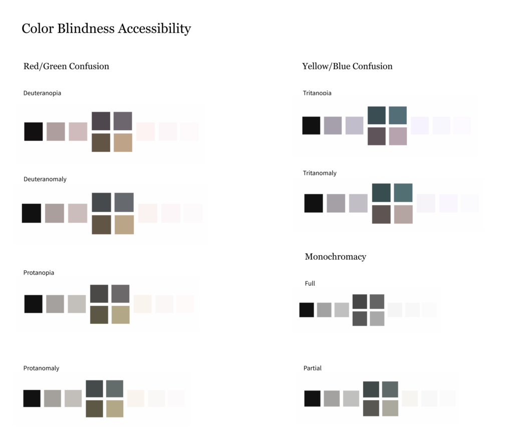
- Make sure the website is accessible and meets WCAG standards
- Mimic the physical museum space in the look and feel
What happened:
- Created documentation for the foundation of an organizational (Agileana) design process.
- Designed an accessible website that met WCAG standards
- Introduced a fresh design that aligned with the organization’s goals and brand identity
- Design received positive feedback from stakeholders
- Improved navigation and usability resulted in a more intuitive user experience
Mockups
Desktop home page
Mobile home page
Exhibits
Exhibit detail
A UX process that changed how we work
In this project, we didn’t just deliver a great user experience, we transformed how the organization (Agileana) approaches UX. What began as a redesign became an opportunity to rethink the process itself. By reframing discovery as co-visioning, simplifying design presentations, validating decisions with users, and clarifying handoffs, we built a model that stakeholders loved. This case study traces that evolution, not just what changed, but why it mattered, and how each shift led to stronger outcomes and lasting impact.
✦ Discovery
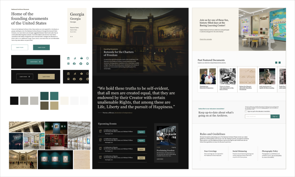
Reframing discovery as co-visioning
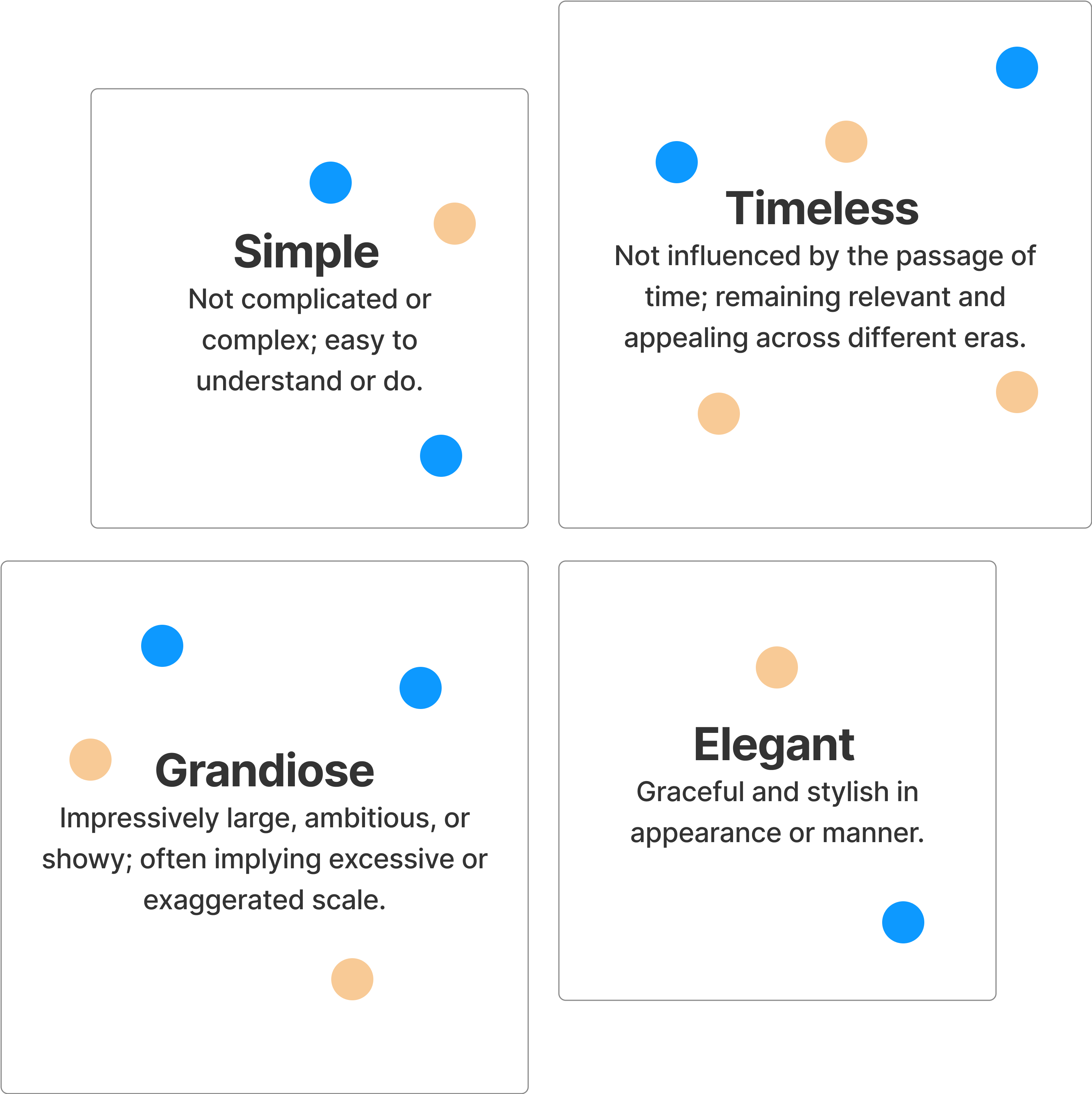
Adding look and feel conversations early on helped turn discovery into a co-visioning space, not just an input session. Stakeholders felt invested, not just interviewed.
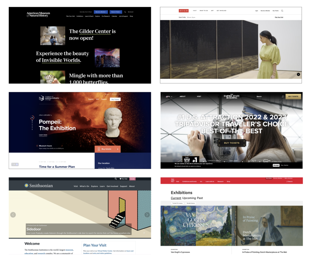
Early in the project, we made a small but important shift: introducing look and feel conversations during the discovery phase. Rather than saving visual direction for later, we invited stakeholders into that conversation from the start. This transformed our workshops from simple input-gathering sessions into shared vision-setting moments. Suddenly, stakeholders weren’t just answering questions, they were co-creating the future experience. That early alignment gave the rest of the process a sense of momentum and shared ownership.
| Process Before 🤔 “We’re talking, but are we aligned?” |
Process After ✅ “We see our input shaping the direction.” |
|---|---|
|
What happened: Stakeholders: |
What happened: Stakeholders: Feel more heard and aligned from the start, they can see a vision forming. |
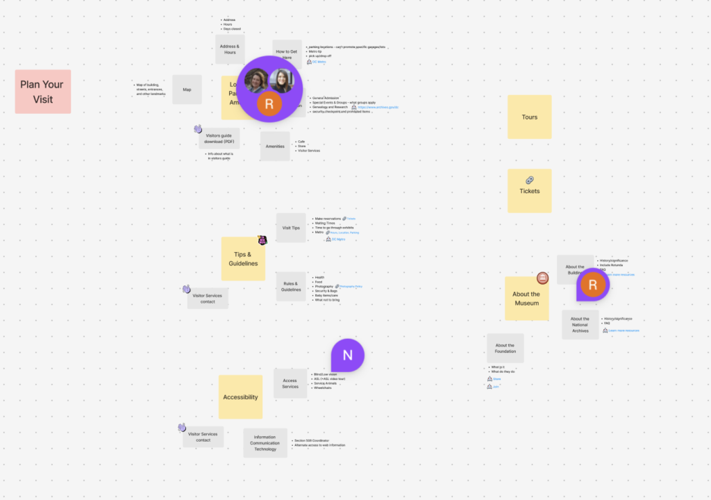
Collaborative activities that helped us align on vision
✦ Design presentation
Reducing visual noise to focus the conversation
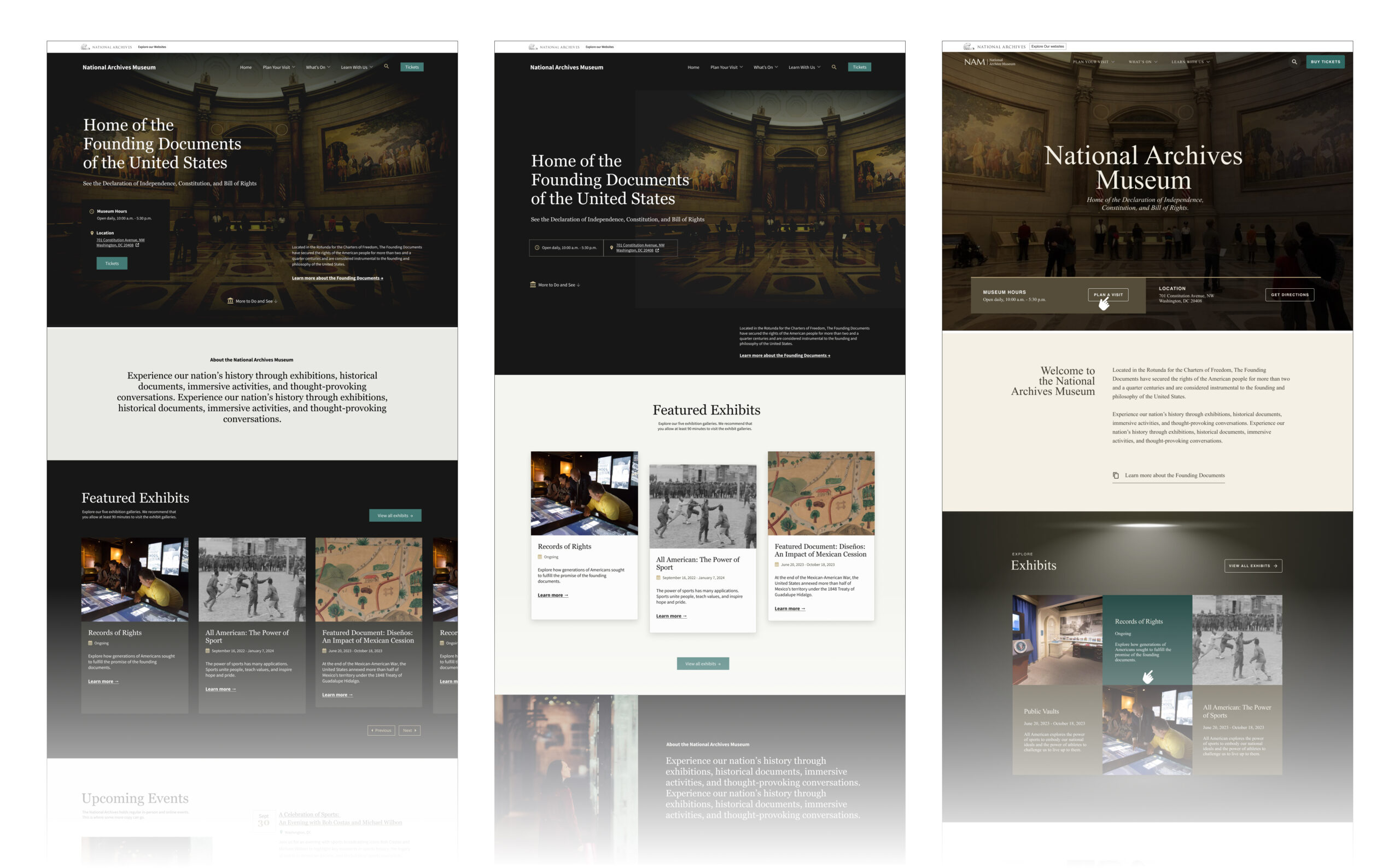
By creating designs with the same look and feel, we reduced visual noise. Stakeholders could think critically about structure, not be distracted by aesthetic preferences.
In previous projects, presenting multiple homepage options with different visual styles often led to scattered conversations, people gravitated toward color palettes and font choices instead of thinking about layout or flow. This time, we kept the look and feel consistent across all three homepage options. It was a deliberate decision to reduce noise and sharpen focus. With style off the table, the team could think more strategically about hierarchy, navigation, and structure, the things that mattered most at that stage.
| Process Before 😵 “Why are we choosing between totally different things?” |
Process After 🎯 “It’s easier to compare these; we’re just focusing on layout.” |
|---|---|
|
What happened: Stakeholders: |
What happened: Stakeholders: More confident and engaged. Focused feedback, less second-guessing of direction. |
Pulling it all together
✦ Refinement
Guiding feedback toward what matters
The streamlined presentation model helped guide feedback. Less “which one do we like?” and more “which structure supports our users best?”
This approach didn’t just streamline visuals, it changed the nature of feedback. Instead of hearing, “Which one do we like best?” we started hearing, “Which layout best supports the project and goals?” That shift in mindset created more productive conversations and helped move us forward faster. Feedback became clearer, more grounded in user needs, and easier to act on. We were no longer sorting through reactions to aesthetic preferences; we were making design decisions based on shared priorities.
| Process Before 😟 “I hope my feedback is being heard and understood…” |
Process After 🤝 “This feels like a true partnership.” |
|---|---|
|
What happened: Stakeholders: |
What happened: Stakeholders: Felt like collaborators rather than reviewers. Saw their input clearly reflected.. |
Iterating to find the best version
✦ Testing
Using testing to build confidence, not just validate
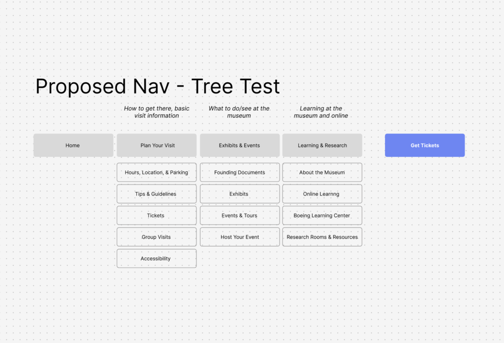
User testing wasn’t just for validation; it built team trust. Suddenly, everyone could rally around real insights, not just opinions.
When we brought real users into the process through testing, it did more than validate, it changed the team’s relationship to the work. Testing didn’t just make the design better; it made the team more confident, more aligned, and more unified in their decision-making. It replaced uncertainty with insight.
| Process Before 🚫 “No clear user input. Are we guessing?” |
Process After 🔍“We’ve tested it. Now we know it works.” |
|---|---|
|
What happened: Stakeholders: |
What happened: Stakeholders: Reassured and confident. Felt designs were truly user-centered. |
Testing for usability and accessibility
✦ Impact
A better site and a better way to work
The project delivered a better museum website and a better way of working that was then documented and used on other projects.
While the project itself was high-profile, the way we worked was just as important as what we delivered. I documented the design process (which is rooted in the Human-Centered Design framework) as an internal resource to guide the design team on future projects.
Each step of the process from onboarding, to discovery, to iterating and beyond was mapped in FigJam. The documentation helped designers stay focused on the right questions at the right time, and created a structured cadence for decision-making, testing, and refinement.
This process also had an unexpected benefit: stakeholders loved the experience. Weekly working sessions felt purposeful. Design reviews felt grounded. There was a clear rhythm and flow and that built confidence.
After the success of this process, it was used on other projects.
This project wasn’t just about improving the National Archives Museum’s web experience. It was about building a better way to work together.
