Integrating and promoting UX while simplifying recruiting
Stratas
Project type
SaaS
My role
Product Designer (Solo)
Company
Randall Reilly
Year
2019-2022
Why this project is important?
This project marked the first time a UX designer was involved in the product design process at Randall Reilly. It was a unique opportunity to integrate UX into the software development process and champion user-centered design principles, even with constraints on resources and time.
Project and Contribution Summary
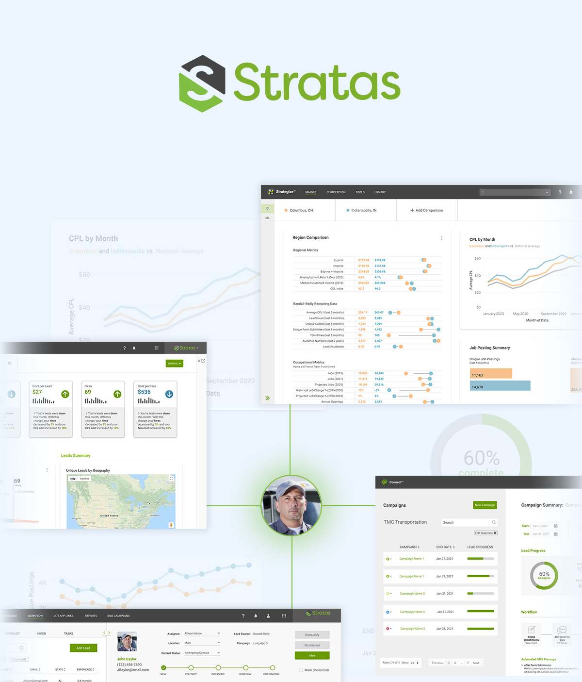
Stratas is a multi-module subscription-based platform that provides visibility into talent pipelines, enabling fast, strategic decisions. From tracking applications to automated nurturing, Stratas empowers growth.
While Randall Reilly offered many valuable services and resources to its clients, it needed to become an integral part of the way its clients did business. For the transportation recruiting division, this meant solving challenges in recruiters’ workflow while meeting business goals.
What I did:
- Acted as the first Product Designer at the company, integrating UX into the software development process.
- Promoted a user-centered approach within the organization.
- Collaborated with multiple cross-functional teams.
- Conducted all preliminary research for modules with limited resources.
- Led every stage of the design process: initial concepts and ideation, information architecture, wireframing and prototyping, Final UI design
- Worked closely with developers during the QA phase.
What happened:
- Delivered a product that marked the first step toward the company’s goal of creating tech-enabled services.
- Met immediate user needs while aligning with long-term company goals.
- Received positive feedback from stakeholders.
Goals
- Enable users to navigate and manage complex recruiting technology effortlessly.
- Empower users to track and analyze recruiting pipelines with ease and clarity.
- Support clients in scaling their recruiting efforts through intuitive, data-driven tools.
- Streamline the recruiting process to save users time and reduce errors.
- Provide tools that empower users to make impactful decisions, improving their work visibility and success.
- Enhance user control over Randall Reilly products and services to optimize for their unique business needs.
How the modules work together
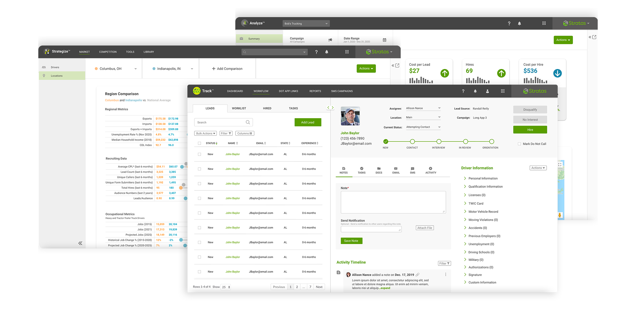
Bob’s Trucking needs to hire more drivers.
Module #1: Enhancing visibility into applicant pipelines
Track
See the pipeline of leads responding to job postings.
Uncovering the origins and evolution of Track
Track (ATS – applicant tracking system) was the first Stratas module to be developed. It originated from an acquired product that needed to be rebranded and have new features added. This case study will primarily focus on Track since being the first, and at the time largest module, required the most research and design. All the other modules would follow in Track’s design patterns, style, and functionality. It was important to get it right.
Conducting research with limited resources
Not having many research resources, I had to collect information from stakeholders, product managers, and in-house user experts. Since Track was an existing product, I was able to access HotJar heatmaps, session recordings, and research competing products.
Research findings included:
Recruiters need easy access to driver information. Many times they are working in their ATS, receive a phone call from an applicant, and have to switch tasks quickly.
Most activity happens on a few screens which the recruiter has to go between.
When recruiters access applicant tables, the tabs default view is set to the least used tab.
Driver data has much of the same hierarchy making it difficult to find key information.
Competing products do not follow best design practices or have the most intuitive user flow.
Hypotheses from findings:
- Making driver information easier to access would help recruiters be more efficient on the phone.
- Reorganizing the main screens recruiters work most on would minimize clicks and allow the recruiter to work faster.
- Switching the default tab view of the applicants table will reduce clicks and will remove friction for the recruiter.
- Adding more hierarchy to the driver data will allow the recruiter to better find what they are looking for.
- Following best design practices and providing a good user flow would put Track ahead of the competition in design.
Track design
Making the recruiter's process more efficient through information architecture
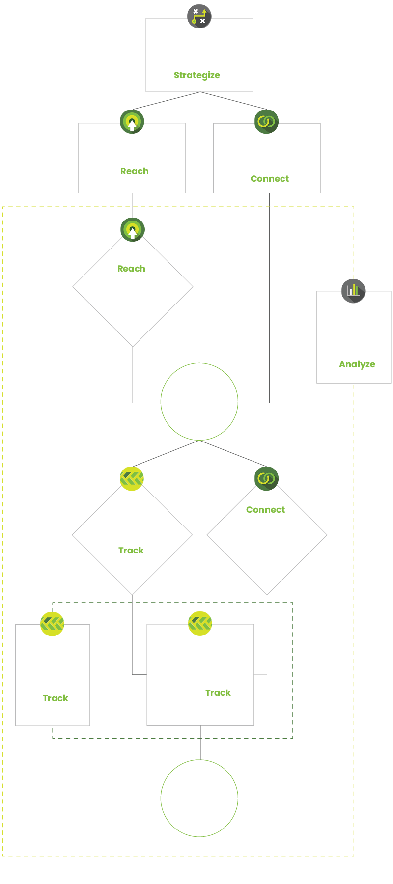
The biggest portion of the Track re-design was to create a new user flow and information architecture that minimized clicks and made the recruiter’s work process more efficient. The original design had the majority of features used by recruiters spread out onto multiple screens. Most of these screens were minimal in what features and sections they contained. It made sense to combine related screens so the recruiter could do all their needed work in one place.


Speeding up the recruiter's workflow
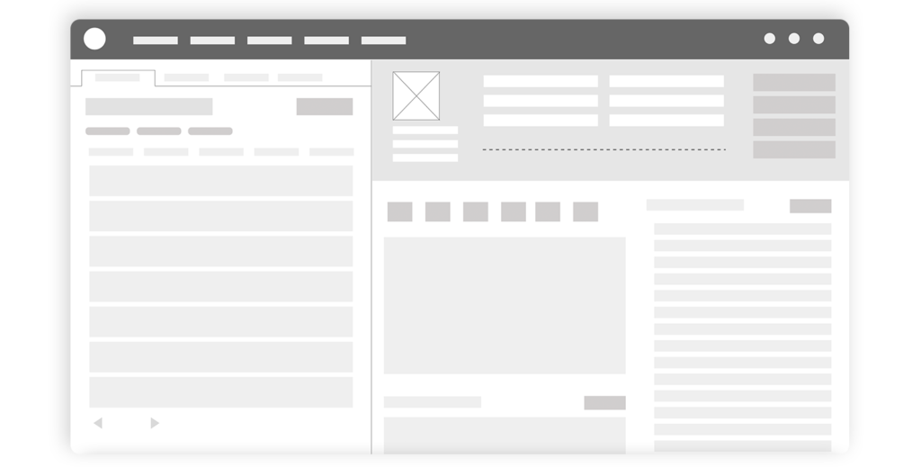
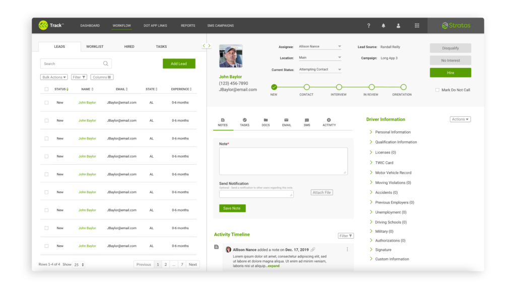
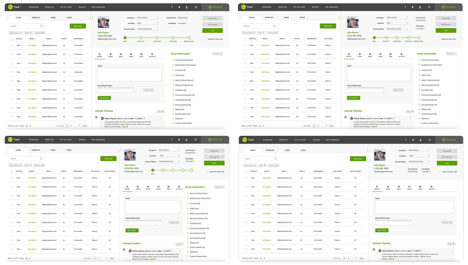
Once the new site map was complete, I began sketching layouts for Track on paper. I then moved to on-screen wireframes. Initially, the driver profile was still on a separate screen from the driver tables. After presenting version 1 wireframes and talking with in-house user experts, the driver profile was combined with the driver tables into a dual-pane format. This allows a recruiter to do a majority of their work on one screen creating a seamless, efficient workflow.
Track design summary
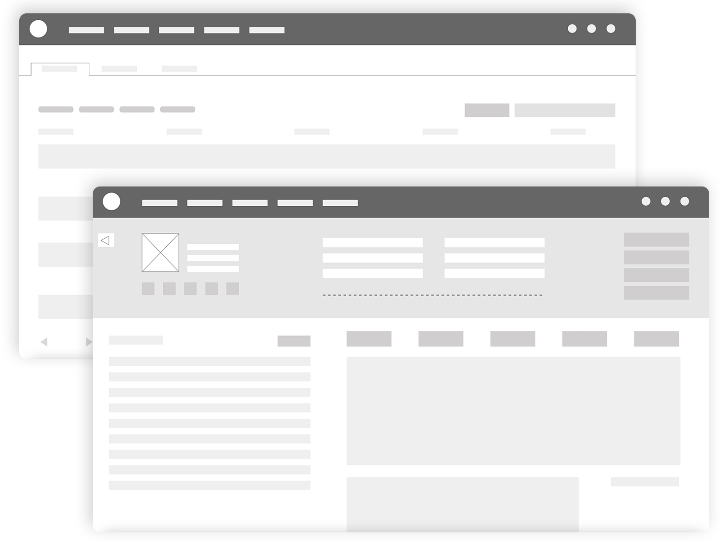
A dual-panel layout makes for easy searching and editing of driver profiles and allows the recruiter to switch tasks quickly.
The default tab is now the leads tab. In the original version, users landed on a lesser-used tab and immediately had to click the leads tab. Other tabs are ordered sequentially based on application statuses.
Important data like basic driver contact, status, and assignee were moved to a prominent place at the top of the driver profile.
Feature highlight: flexible workspace
The dual-panel layout may keep the user on one screen, but with the amount of information present, it could become a difficult space to work within. Giving users the ability to make one side of the screen larger as they work alleviated this. Certain sections and features become easier to access and use. For example, if the user needs to add columns to the driver table, expanding that panel will help them do that.
This feature combined with the all-in-one work screen gives Track a better user flow and function than its competitors.
Modules #2-4: Designing additional modules to complement the ecosystem
Analyze
Compile all data from recruiting efforts in one platform.
Strategize
Empower recruiting with competitive insights, driver market insights, and campaign trends and benchmarks.
Connect
Automate driver text messages and phone calls.
Laying the groundwork for tech-enabled access
Unlike Track, the remaining modules were built to give client-facing UIs to existing, proven Randall Reilly products and services. These UI’s would put more power in the hands of the client and allow them to access things like their Randall Reilly campaigns and Randall Reilly’s vast industry data.
The discovery phases for these modules were much simpler than Track’s. These were completely new UI’s which means there were no heat maps or user data to help make design decisions.
Collaborative research
Product managers for these modules were experts with the associated product or service and its users. Each product manager provided me with a basic outline of what needed to be in the UIs to give the client full access. I also learned what I could about the products or how the services were performed to make educated decisions. This not only gave me insight into the needs of the user, but also what these UI’s would connect to or trigger on the back end.
Research findings included:
- Not all of Stratas users can interpret data well.
- Some services provided through these modules still require edits to be performed manually by Randall Reilly employees through a ticketing system. This takes power away from the user.
Hypotheses from findings:
Presenting data clearly and simply will make it easier to understand and help users get the most out of the platform.
Integrating the UI with the ticketing system and allowing the user to visually edit will give them the illusion of more power versus filling out a ticket form.
Balancing best practices with fast timelines
After mapping all the needed features and coming up with what I thought was the best organization and user flow, I began doing sketches on paper. Being the only product designer, most screens for these modules went directly from paper sketches to high-fidelity mockups. There simply was not enough time to lay everything out and get the mock-ups to development on schedule. No testing was being done before development and stakeholders had already approved my site maps and information architecture. This meant wireframes were really just for me to explore iterations. I had to rely on my design background and what I knew about best practices for these modules.
With Track past the design phase and company branding guidelines in place, I was able to pull the design and feature styling from those. This not only made designing easier but is a good practice to give continuity to the modules. For example, all tables and charts will look the same throughout all of Stratas. If there were like screens across modules, I arranged the pages as similarly as possible.
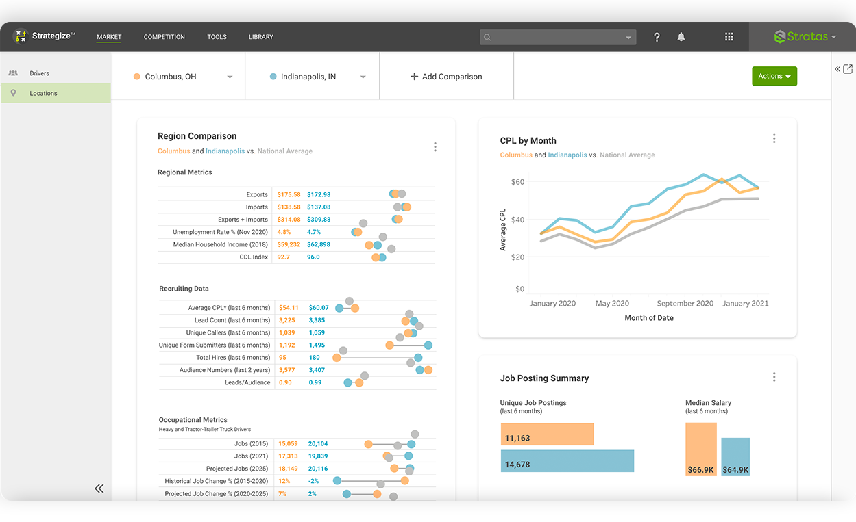
Analyze and Strategize design summary
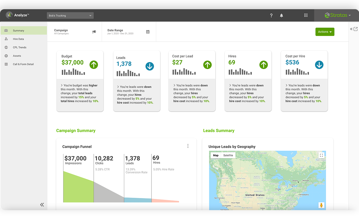
- Charts follow a card layout to designate which charts can be exported together and to group them by category.
- Continuity between modules was very important. Filters, side navigation, and dashboard actions all work the same across both of these modules.
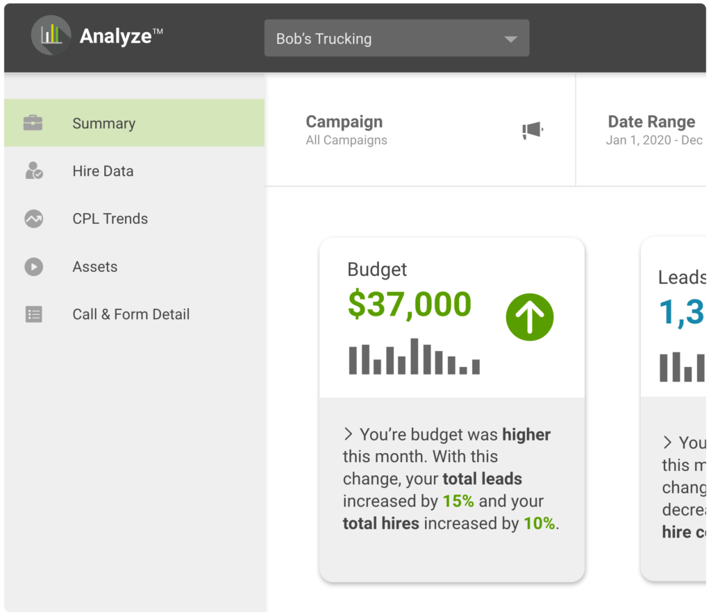
Feature highlight: narrative data
Both Analyze and Strategize are data-heavy modules. From my research, I knew some users may have a hard time drawing conclusions from data. Large summary metrics were added however, to take this a step further, I proposed adding data in a narrative format.This helps users understand what the dashboard is showing them qualitatively and gives a deeper understanding of the data to a larger audience.
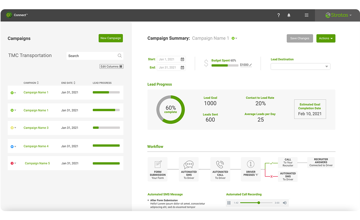
Connect design summary
Connect follows Track in its dual-panel layout for continuity.
When updates to a campaign are saved, a ticket is triggered on the back-end. To the user, it appears they made campaign changes, but really they created a ticket. This gives the illusion of more power to the user.
To further add to the power illusion, specific language was chosen for certain UI elements. One example was using the word “processing” instead of “in review” for the campaign status of an edited campaign.
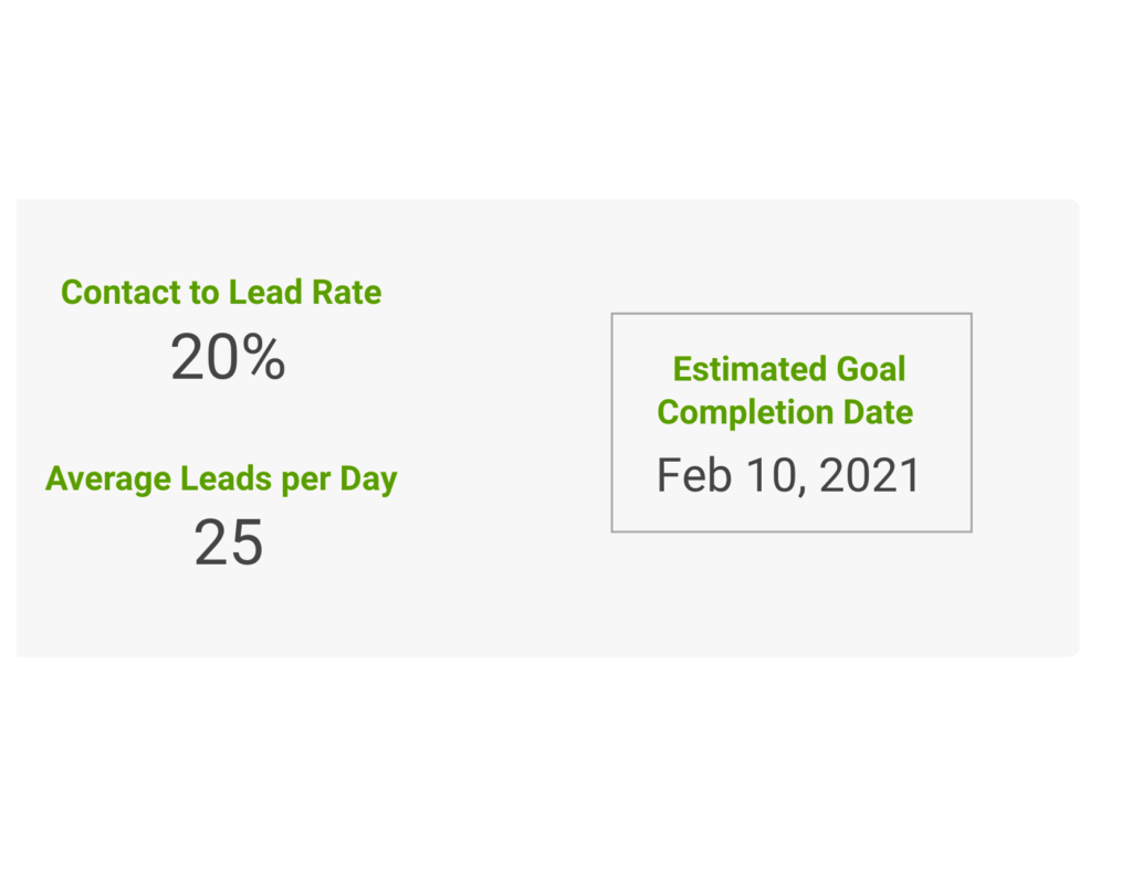
Feature highlight: predictive metrics
When setting up a campaign in Connect, the user selects an end date and lead goal for their campaign. However, sometimes the lead goal is not met before the campaign end date. Most of the reporting from Connect campaigns is found in the Analyze module, however, I thought having a predictive metric of lead goal vs. campaign end date in Connect would be beneficial to both the user and Randall Reilly. Showing the user a predicted goal completion date would allow them to compare it to their set campaign end date. If this goal completion date was further out than their campaign end date, they could make an informed decision on either extending their campaign end date or increasing their budget to meet their goal.
One of the goals of Stratas is to make the user a workplace hero. This feature gives them the insight to make informed campaign decisions for a successful campaign and to help their company reach its desired outcome.
Unifying the modules
With the development of new modules, a header that allowed users to switch between them, access individual module screens, and get to global features was needed. With some modules being more complex than others, it was important this design was expandable. Different subscription types had to be considered as well. Some users may subscribe to all the modules, while others subscribe to one. The header needed to look consistent no matter what modules the users subscribed to.


Challenges and lessons learned
Stratas was my first product and my first time working with developers and product managers. I was also the first product designer at the company.
My biggest challenges were:
- figuring out how to insert myself into the design process across teams with different ways of working
- learning how to work with developers after mockup handoff
- I was the only designer and spread thin between multiple projects
- limited resources meant there was no testing before development
Things I learned in this process:
- an understanding of good design practices is important when resources are limited
- different teams communicate in different ways and it’s important I am flexible and learn the ways to best communicate back
- a better understanding of the product design process
- better ways of working with product teams
