Unifying the US Courts design system while automating accessibility

Project type

Web

My role

Lead UX Designer

Company

Agileana / US Courts

Year

2023-2024

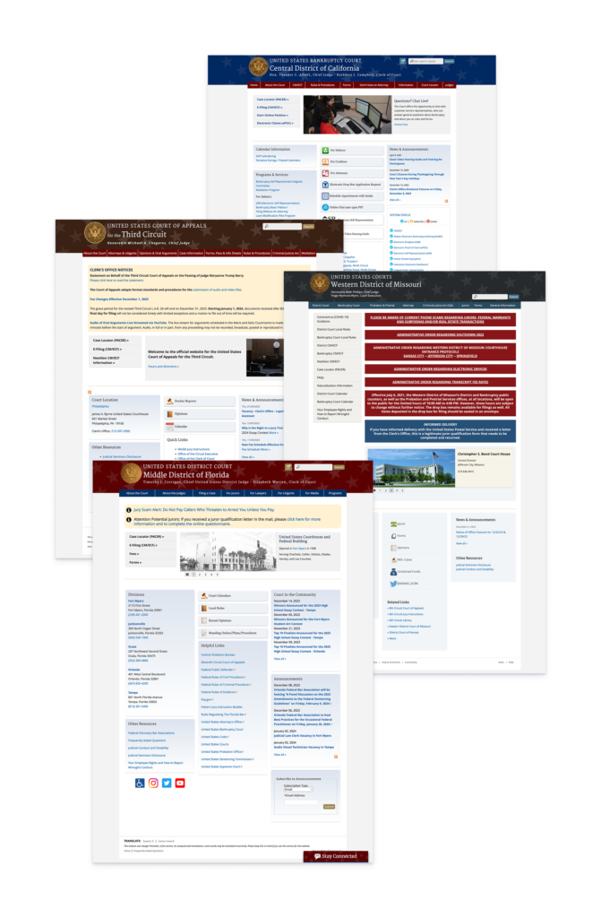
Why this project is important?

Redesigning the US Courts’ design system with a focus on accessibility was a strategic effort to ensure that everyone, no matter their ability, can easily access important government information. Accessible websites are essential for fostering inclusivity and public trust, as they connect all citizens to their government. This project required careful planning and collaboration to create a user-friendly experience that meets high accessibility standards, giving everyone the same opportunity to navigate and understand vital resources.

Project and contribution summary

In this project, a template system was created for the UC Courts websites. This included the main UCCourts.gov website along with 300+ lower court websites.

What I did:

  • Content and Design Strategy: Reviewed research to prioritize essential information, designing layouts that improved content discoverability and user focus.

  • Created Scalable Design System: Designed a flexible design system for 300+ court websites, balancing customization with strict accessibility controls.

  • Adaptive Strategy: Pivoted from court-type layouts to content-based layouts, addressing unique needs identified through research.

  • Created Alignment: Facilitated discussions to align stakeholders on key design decisions, addressing concerns and building consensus around design.

  • Testing Strategy: Developed and executed a user testing plan to validate the effectiveness of the information architecture and key components.

  • Iterative Improvements: Made research-driven adjustments to the information architecture and components, ensuring a more intuitive and accessible user experience.

Goals:

  • Create a cohesive look across all court websites while allowing customization
  • Ensure WCAG accessibility standards are met across all design elements
  • Improve usability and information architecture


What happened:

  • A flexible design system with built-in accessibility controls
  • User-friendly templates refined through iterative testing
  • A consistent yet adaptable digital experience for all courts

Hero mockups

USCourts.gov

Lower courts

Flexible but inclusive design through a strategic process

When every U.S. federal court uses the same outdated website template, but each one serves a different community with unique needs, designing a unified system becomes more than a redesign. It becomes a balancing act between structure and flexibility, consistency and autonomy. This project reimagined how 300 courts could manage content, uphold accessibility, and reflect their identities without overwhelming users or the non-designers maintaining the sites.

One template, 300 visions

When flexibility became a liability across the federal courts

Before this redesign, all U.S. federal courts used a shared website template that hadn’t kept pace with accessibility standards, design best practices, or modern content needs. 300 courts from across the system (Bankruptcy, Appellate, District, Probation, and Special Courts) were expected to make it work for their unique needs. Over time, that led to a sprawling patchwork of digital experiences.

While the template offered shared components, the CMS (content management system) where these websites were built, lacked meaningful constraints. Each court could customize layouts, apply their own colors, and structure content however they chose.

The problems:

► Color choices sometimes created contrast issues, undermining accessibility.

► Navigation menus were bloated, sometimes wrapping to two lines on desktop.

► Dense pages overwhelmed users with text and lacked clear visual hierarchy.

► Non-designers managing content in the CMS had no guardrails to prevent accessibility or usability issues.

Grouping of court websites with original templates identifying the court type by the color used in their headers
Original court website template with court types identified by the color used in the headers

From an earlier round of stakeholder interviews, we knew each court still wanted their freedom to be unique and express their individual identity. We needed to give them a foundation that honored their autonomy when building their site without compromising the experience for the people who needed to navigate them. Without strong foundations, flexibility became a liability.

How can we give courts the freedom to feel “seen,” while protecting their users from inconsistent or inaccessible designs?

Start with listening

What courts really needed from their websites

Throughout this project, we facilitated stakeholder meetings and workshops. We paired these sessions with a review of site analytics and third-party research focused on user behavior.

From these activities, we determined what the system needed to support:

► A baseline of consistency and accessibility across all court websites

► Support for flexible customization giving courts ways to reflect their identity without compromising usability

► A content strategy that prioritized clarity, hierarchy, and findability

We then aligned around three core strategies to support those needs:
1. Bake accessibility into both the CMS and the design system

Prevent accessibility errors by building smart constraints directly into components and admin workflows.

2. Design a unique home page hero section for each court type

Courts would be differentiated visually through custom hero layouts based on court type (Bankruptcy, District, etc.) giving each court a sense of identity.

3. Restructure the information architecture

Ensure the content determined by research to be of high-value for the users was easy to find

Our strategy wasn’t to control every pixel. It was to design a system where the right things happened by default.

Designing a system you can't break

Accessibility by default

This template system and CMS was designed for non-designers like staff members, clerks, and admins who needed to update court sites without breaking them. From the start, accessibility was part of the blueprint, not a checklist at the end. We built constraints directly into how courts created and managed content to ensure that even inexperienced content authors could publish accessible, user-friendly pages by default.

To protect accessibility and support user friendly layouts we:

Developed a curated set of accessible color palettes, each tested against WCAG 2.2 contrast standards. These palettes aligned with U.S. Courts branding but offered enough variation for courts to feel distinct.

A sample of color palettes used for the UC Courts template system
Color palettes available for CMS admins
A grid of all the available shades of gold in the color palette. Each color has an accessibility pass or fail label for light or dark text.
Pass/fail text color tests for every color

Removed the ability to choose text colors. When an admin selected a background color, the system automatically applied an accessible text color eliminating risky manual choices.

A list of approved background colors for the websites text colors. For the dark text color, there are 4 light backgrounds. For the light text color there are 3 approved backgrounds.
Backgrounds available for selection in the CMS along with the auto-applied text color

Predetermined and locked in how colors would be applied to certain components based on selected color palette.

A mini card component showing all the color possibilities when different color palettes are applied.
  • Instead of custom font controls like font and font size, we offered a set of predefined, accessible text styles to promote consistency and readability across all the sites.
  • Limited the number of columns an admin could place in a row, reducing the temptation to overpack pages with content.
  • Removed unnecessary Gutenberg blocks that encouraged overly complex layouts.
  • Added character limits to specific components to prevent content overflow and preserve design integrity
  • Forced the navigation to collapse into mobile view before it wrapped to two rows on desktop, maintaining usability and visual balance across screen sizes

We didn’t just create accessible components, we created an environment where authors couldn’t accidentally make inaccessible decisions.

We designed. We tested. We iterated.

Building a design system through real-world feedback

User testing focused primarily on the custom components we built outside of the USWDS (United States Web Design System) library that was being used on this project. These were the elements most at risk of usability or accessibility issues, and where we needed to validate design decisions with real users.

We also tested the findability of key features, including the global search function and primary navigation items. Our goal was to ensure that users could locate critical content quickly and intuitively.

Comparison of two test results for the US courts mobile menu. In version 1 there are many dots representing misclicks missing the intended click target. On version 4 all dots are concentrated on the correct click target showing the progress made through testing multiple iterations of the menu.
Mobile menu test that resulted in moving the top level page link out of the header section

During testing, we uncovered several usability issues, particularly with how some components were layed out. We took this feedback and iterated quickly. The result was a set of components and interactions that tested positively in follow-up sessions.

User quote honorable mention:
“I don’t like the government but this website is pretty nice.”
– Test User

Examples from the completed design system:

By the end, the system didn’t just meet standards, it worked for the people using it.

From court types to content needs

The pivot that made it work

One of our original ideas for differentiating each court was to design custom hero layouts tailored to the five main court types (Bankruptcy, District, Appellate, Probation, and Special Courts). We imagined each layout reflecting the priorities of that court type, offering a sense of identity through visual structure rather than just color. It aligned with our early goal of giving each court a hero section that felt purposeful and unique.

But as we progressed through stakeholder interviews and reviewed live court sites, cracks in that approach started to show.

In reality, courts of the same type often had wildly different content needs:

► Some published frequent news updates and announcements

► Others needed just one or two static messages to direct users to important content

► A few wanted to feature documents or contact information right up front

A grid of 6 home page hero screens showing the 6 templates made for the us courts template system

So, we pivoted. Rather than mapping hero layouts to court categories, we restructured them around content needs.

  • A CTA focused layout
  • News & Announcements focused
  • Informational
  • Featured content
  • Minimal

Each court could choose the layout that best suited its communication strategy, not its classification.

This strategic shift also reinforced our broader goal: offer meaningful choice, but never at the cost of usability or maintainability.

From chaos to confidence

A scalable system for every court

This project didn’t just deliver a redesigned interface, it delivered a foundation for consistency, accessibility, and autonomy across a complex and decentralized network of courts.

By building a system that:

  • Bakes accessibility into content creation
  • Supports flexible identity without sacrificing usability
  • Reduces complexity for non-designers

…we’ve enabled courts to serve their communities better, not just with compliant websites, but with clarity, trust, and efficiency.

Admins now have the confidence to manage content without worrying about breaking layouts or violating accessibility standards. Courts have options to reflect their unique voice, but within safe boundaries. And users often navigating important information, now experience more consistent navigation, clearer content, and improved access to what matters most.

The design system is now positioned to scale across additional courts with minimal overhead, ensuring this isn’t just a one-time improvement, but a sustainable framework for the future of federal court websites.

Let's talk more about his project