Iterating to support the future of work
Workspace booking calendar
Project type
SaaS
My role
Senior Product Designer
Company
Enterprise worktech
Year
2023
Why this project is important?
This project shows how the design process can be complex and non-linear. It’s important we test and then iterate on those test to create the best version of design even if that means reworking the design completely.
Project and Contribution Summary
For organizations adopting the hybrid work model, hot desking and hoteling are two office space management concepts that are becoming increasingly popular. Both approaches involve employees sharing workspaces and resources rather than having a fixed, assigned workstation. To facilitate this, companies use software solutions that allow employees to book the space they need when they need it.
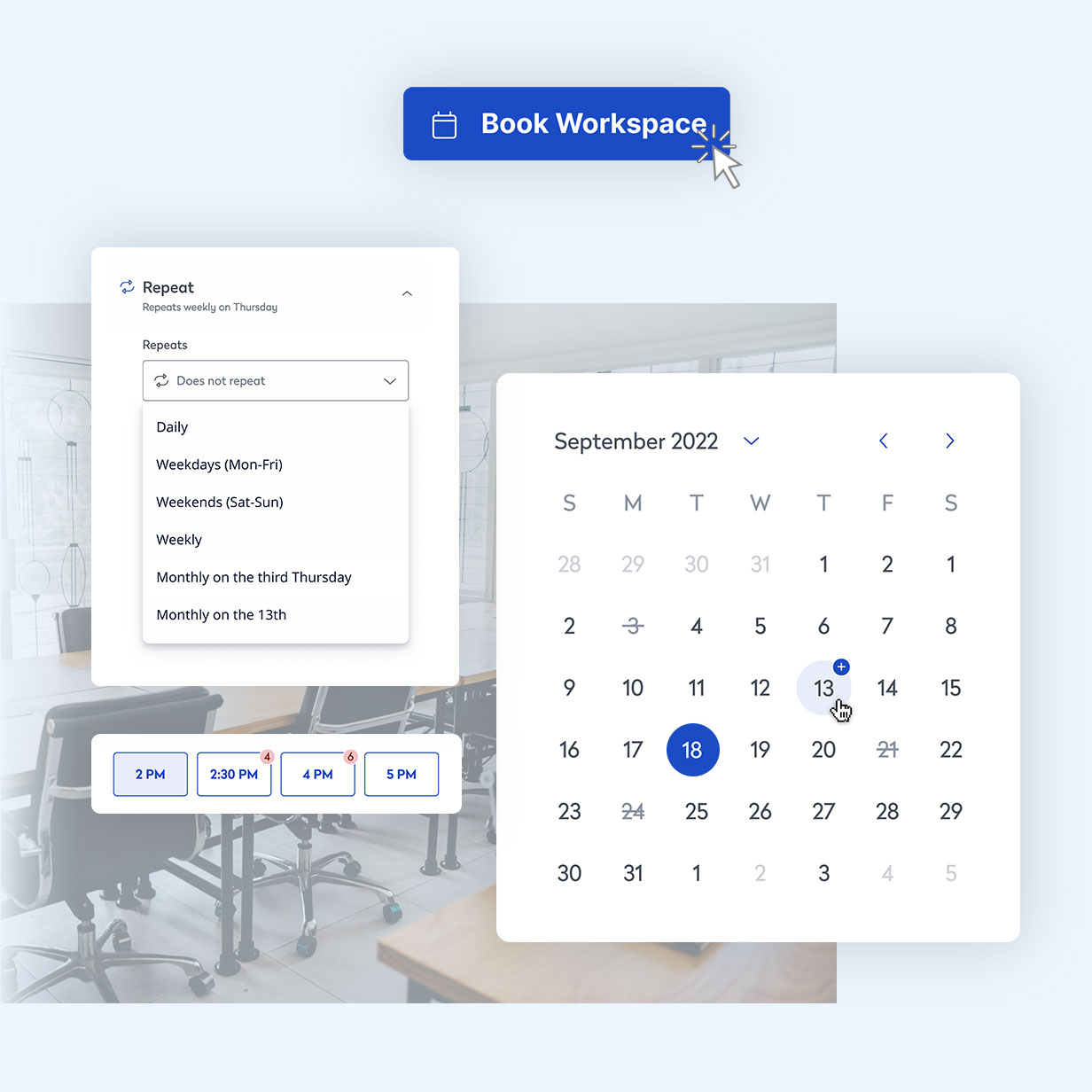
This calendar integration is for one of those booking platforms. While taking into account all space types and date selection patterns, it presents the user with a simple but highly informative interface. Its scalability not only allows for the user’s needs today but also keeps in mind the future product vision.
What I did:
- Iterated on designs based on user feedback and changing project requirements
- Translated complex product requirements into a simple, easy-to-use design
- Collaborated with a cross-functional team to deliver the final design
- Utilized and contributed to the design system
- Planned user tests
The results:
- Delivered a feature that helped move the company toward their next-generation product.
- A fully functional booking calendar that accommodates user needs, received good user feedback, and is scalable for the future.
- Received positive feedback from stakeholders and users.
Goals
Users:
- Create a booking calendar that accommodates all space types (desks and meeting rooms), ensuring ease of use for different user roles such as office employees and administrators.
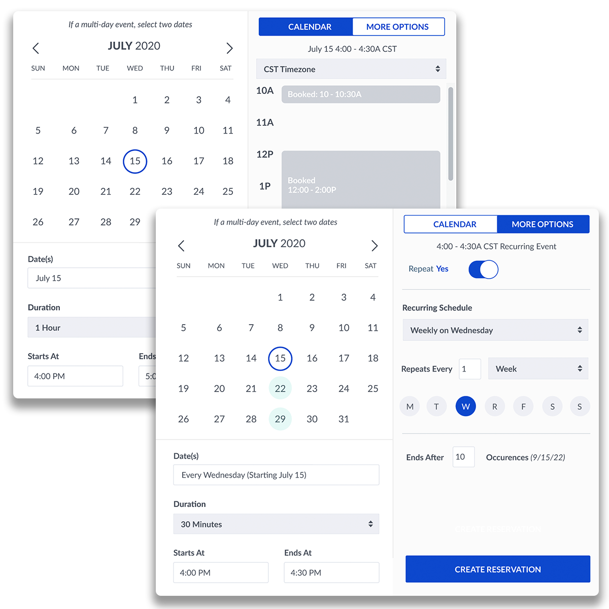
- Provide a comprehensive range of date selection options, including single date, recurring date, multi-day, and custom (a combination of recurring and single).
- Implement a clear and intuitive method for surfacing and managing date conflicts, such as conflict alerts or suggestions for alternative times.
Strategic:
- Consider potential future use cases and additions to the calendar during the design process to support scalability.
Technical:
- Design the calendar to be compatible with current “legacy” products while also being adaptable for future unified product releases.
- Utilize as many existing design system components as possible, while identifying any necessary adjustments to support new calendar functionality.
Accessibility:
- Ensure the booking calendar is accessible to all users, including those with disabilities, by following best practices for accessibility.
Moving to a unified product
It can be difficult to integrate the features and use cases of multiple products into a single, comprehensive product. When consolidating a worktech suite that focuses on space booking, it’s essential to consider the date and time selection tools.
This project was originally an expansion of a calendar date selector on a “legacy” product. As time went on and the “legacy” products began to move toward a new, unified product, the goals of this project changed. It was decided this booking calendar should be a global element that could be used in any of the current products as well as the future product.

As a designer, be ready to pivot
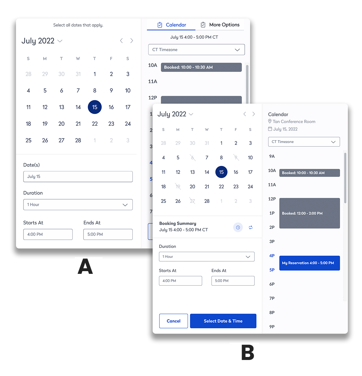
This project was already in progress when it was assigned to me. Many iterations had been done and a first round of research was completed. The favorite design had tested well but was still missing some project requirements.
After getting up to speed on the project, I began working on those last action items and created a second variation to make sure this was the direction we wanted. An A/B test was completed and the original design came out on top. This version was then tweaked and tested one more time before the final version was able to be submitted for development.
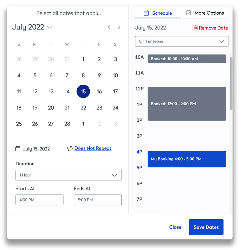
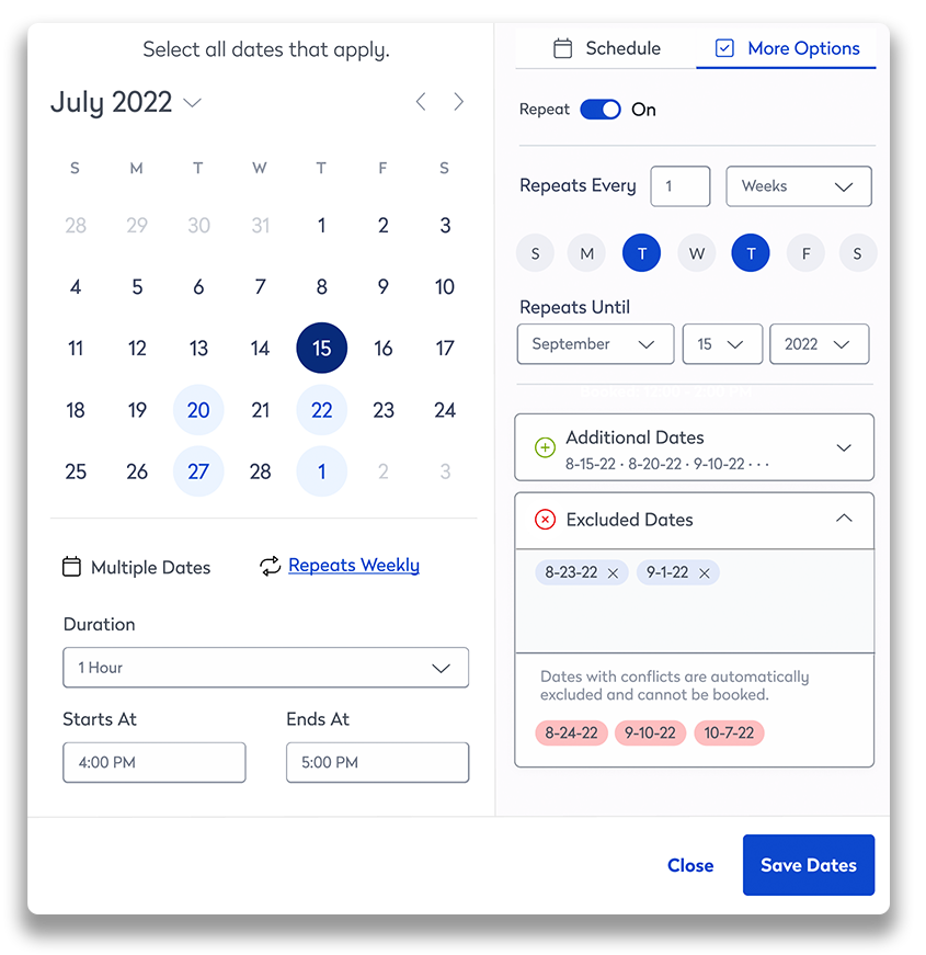
However, the design process is rarely linear with this project being a prime example.
The design system and development teams raised some concerns about the height of the modal and the difficulty of working with the two-column UI. It was back to design for the calendar booking tool.
Working together to find a solution
Advice from the design system team was to try using the sidebar found in the design system. Initially, a compromise was attempted in having a simplified “quick book” modal with the expanded “more options” view opening in the sidebar. When tested, users had fewer positive things to say about this version versus all the others that had been tested.
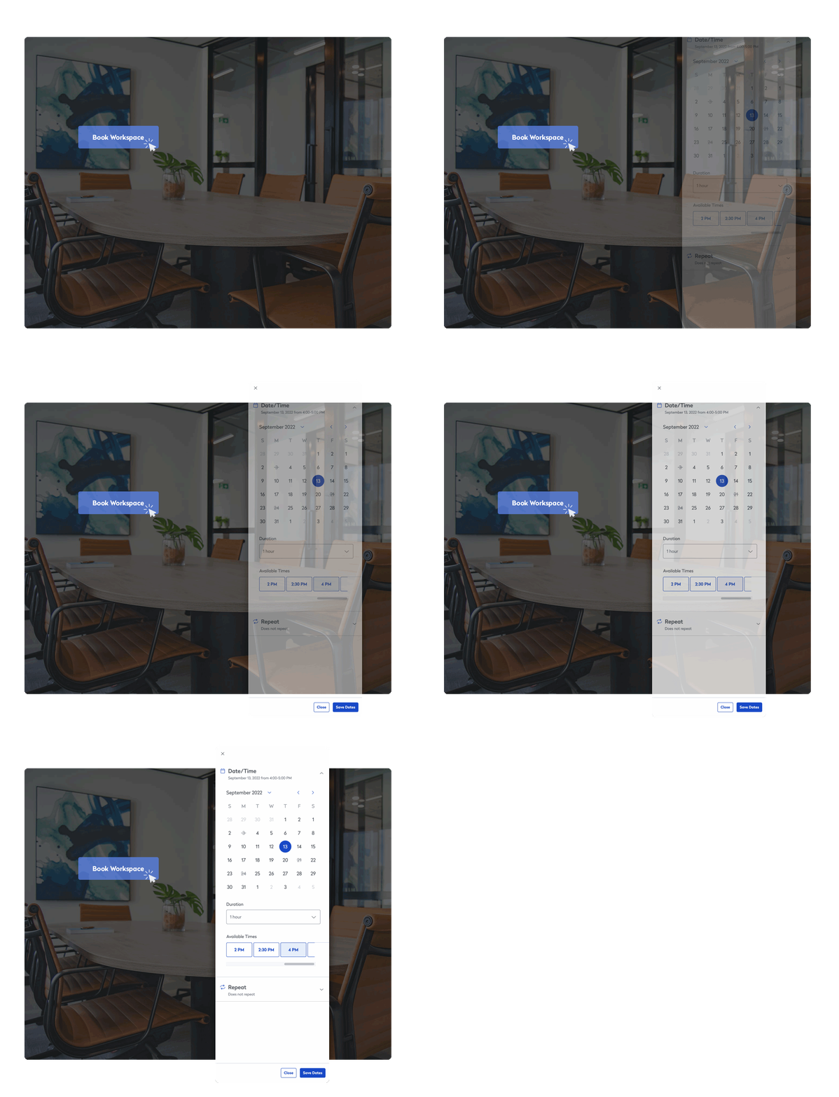
The main culprit for these less-than-favorable reviews seemed to be the jump from a modal in the middle of the screen to the sidebar. With this information, the modal was completely removed from the design, and the calendar was finalized in the sidebar.
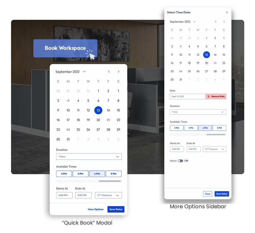
Adapting the design to be a single-column
Rethinking the information architecture
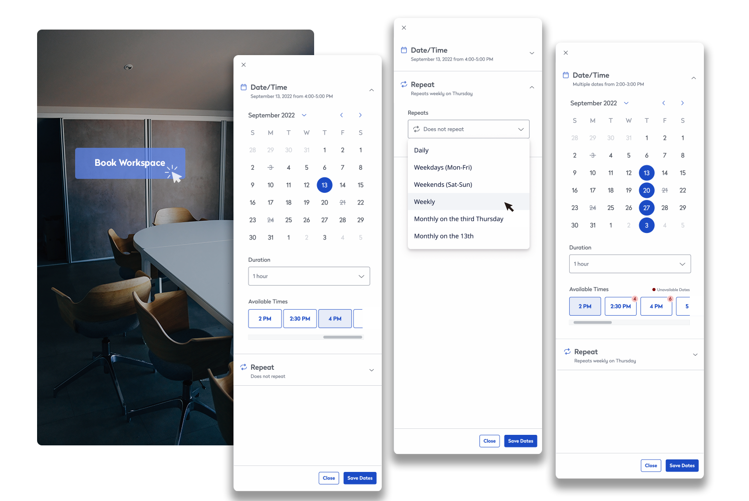
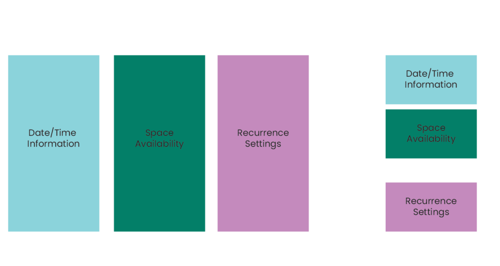
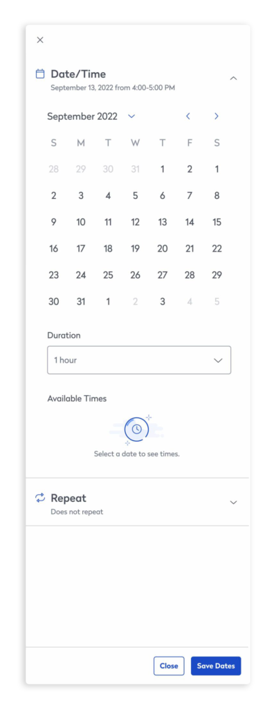
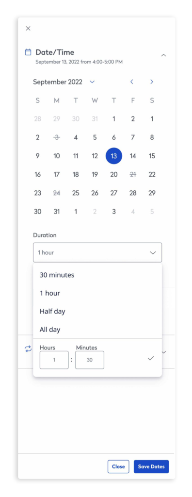
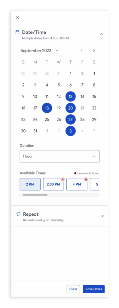
Content in the double-column modal gave users the ability to easily compare their date selection with the space information. With the single-column design, this comparison was kept by grouping the date and space information in an accordion component. The recurrence information was grouped into its own accordion. Having only one accordion open at a time brings all the users’ focus to that one group and reinforces the relationship its content has.
Making the booking calendar modular by using accordion groupings allows for more content to be placed in the sidebar without forcing the user to scroll. Future feature expansion is also made easier by adding additional accordions.
Adjusting the components
The modal version of the calendar had been tested several times. Users understood how to use its components, so keeping them as similar as possible was important. However, with the single-column design, certain components no longer worked as well.
Scheduler
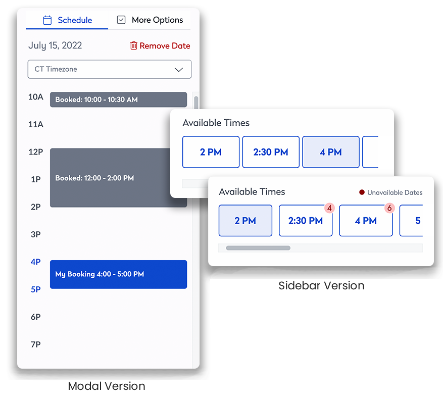
A full-space schedule was shown in the right column of the original calendar modal. With everything displayed in a single column, the schedule was reduced to a list of available times saving vertical space. This turned out to be a potentially powerful tool. While available times are shown when only booking a single date, this changes to “most available times” when booking multiple or recurring dates. Times are suggested and ranked based on how many booking conflicts there are at that time. This calculation could get even more sophisticated in the future by considering participant availability or time zone.
Adding and removing dates
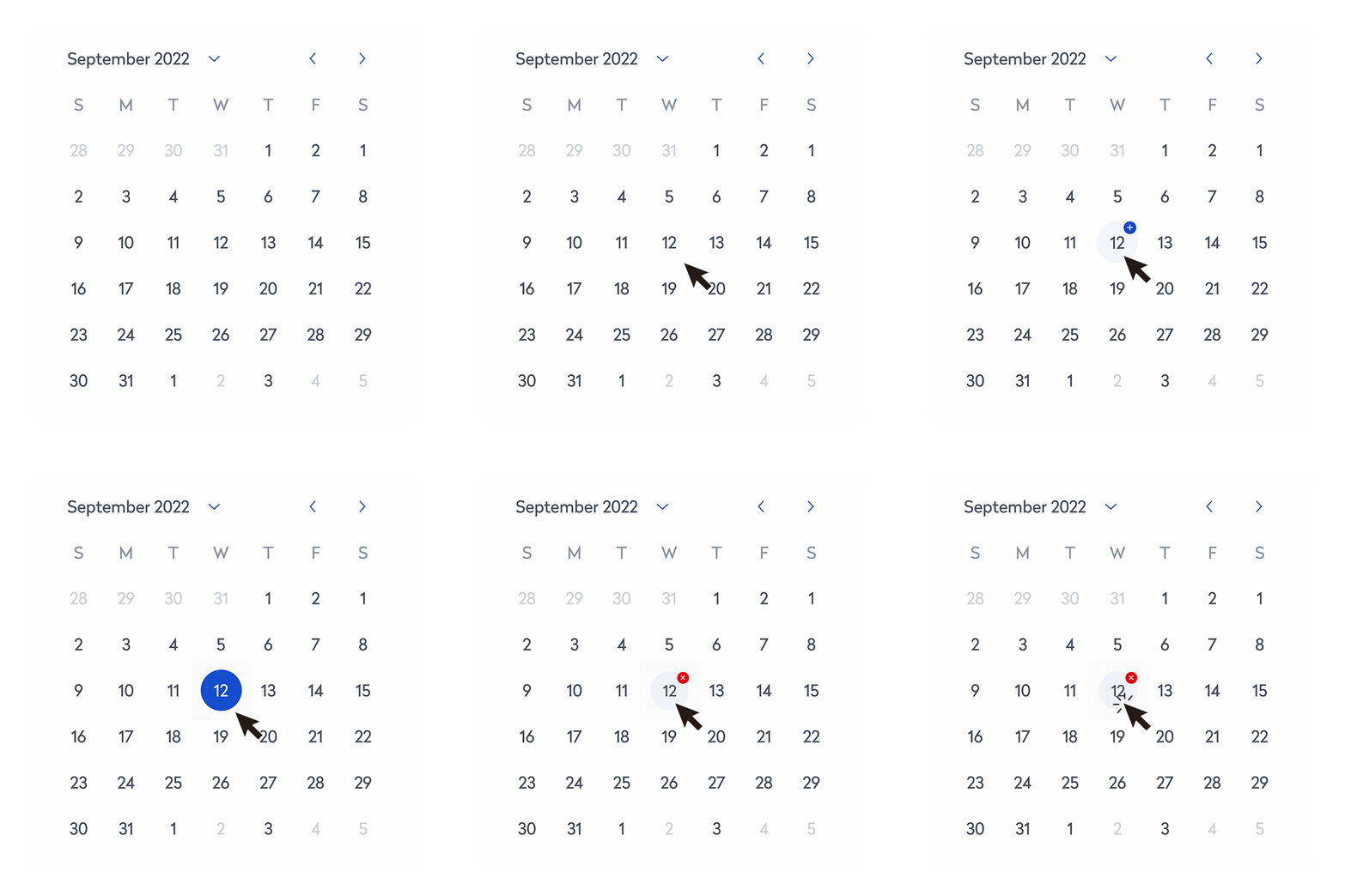
Previous research suggested clicking a date once to book and twice to remove was foreign to some users. They were looking for ways outside the calendar to remove a booked date. To alleviate this, additional ways of removing dates were added to the calendar. In the final sidebar version, these additional ways were removed. Instead, “+” and “-“ hovers were added to the calendar to educate and show users what would happen if they clicked the dates.
Communicating date conflicts
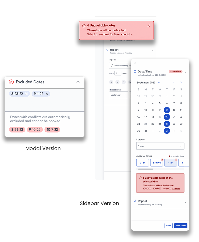
The first requirement I was tasked to resolve when assigned this project was adding a way to surface conflicts. On the initial release of the calendar, there would be no options for conflict resolution. Instead, the dates with conflicts simply would not get booked. It was important the user was aware of these dates.
In the modal version of the calendar, dates with conflicts were listed in the “excluded dates” section. Now that the “excluded dates” section had been removed there needed to be a new way to notify the user.
A goal of the calendar was to use as many design system elements as possible. Therefore, a combination using a toast and tag direct the user to the date/time section where an inline error lists the dates. All these components are part of the design system and in the end, bring more attention to the conflicts versus the original modal version.
The final, final version
While the original double-column modal design was well-liked, the resulting sidebar version met all the project goals and garnered approval across all teams. After so many iterations and rounds of testing, there was confidence this was the best and final design.
Challenges and lessons learned
My biggest challenges were:
- A switch in PM and other team member roles seems to have caused some things to get lost in the shuffle.
- The timing of the project around the holidays and other company travel drew out the design phase. It was difficult to get all stakeholders’ eyes on the calendar at every meeting.
Things I learned in this process:
- When inheriting a project, ask a lot of “why” questions about the current design
- Teams need a unified design approval system
- Study all the details of the design system
